Back to work
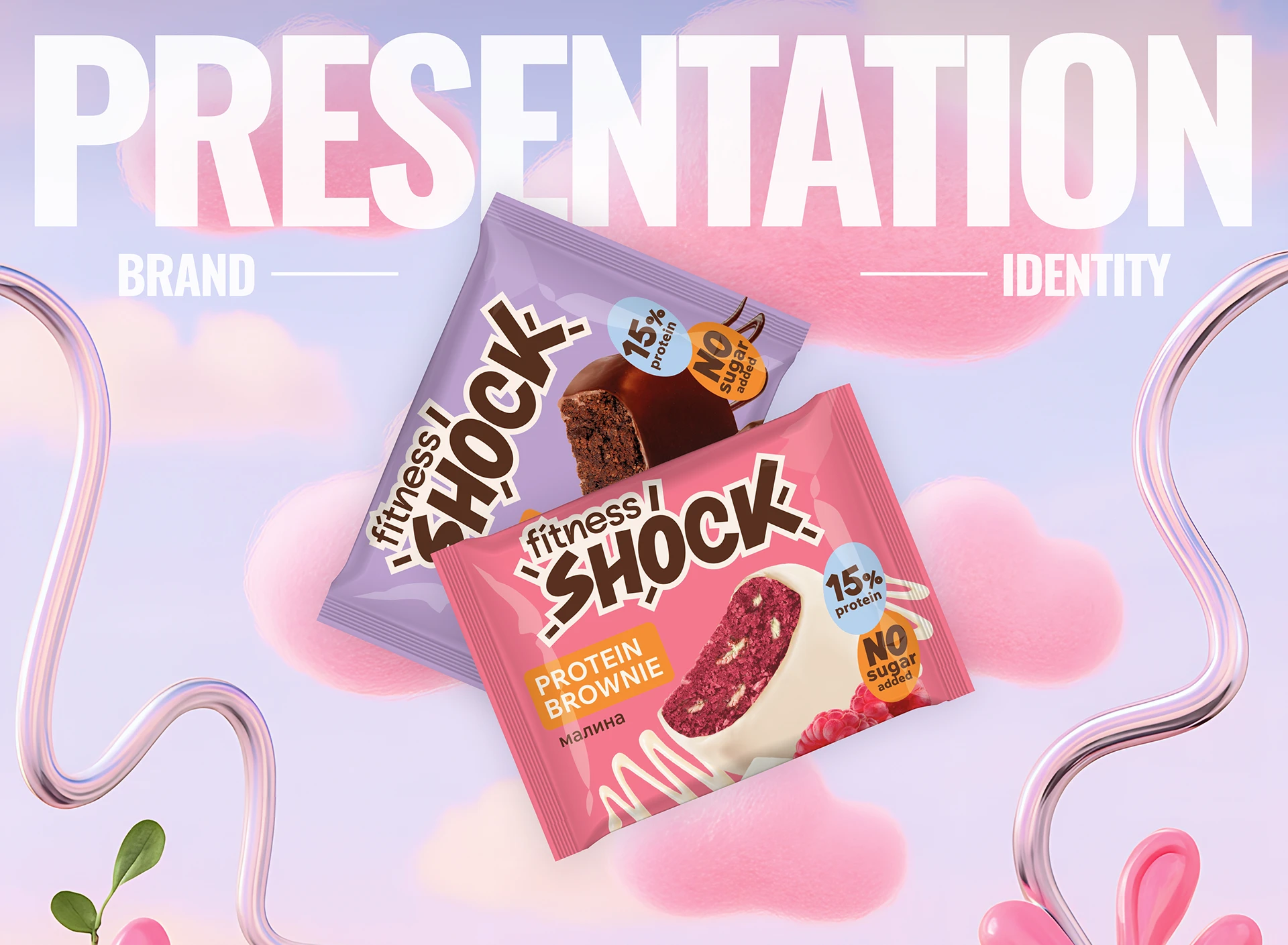
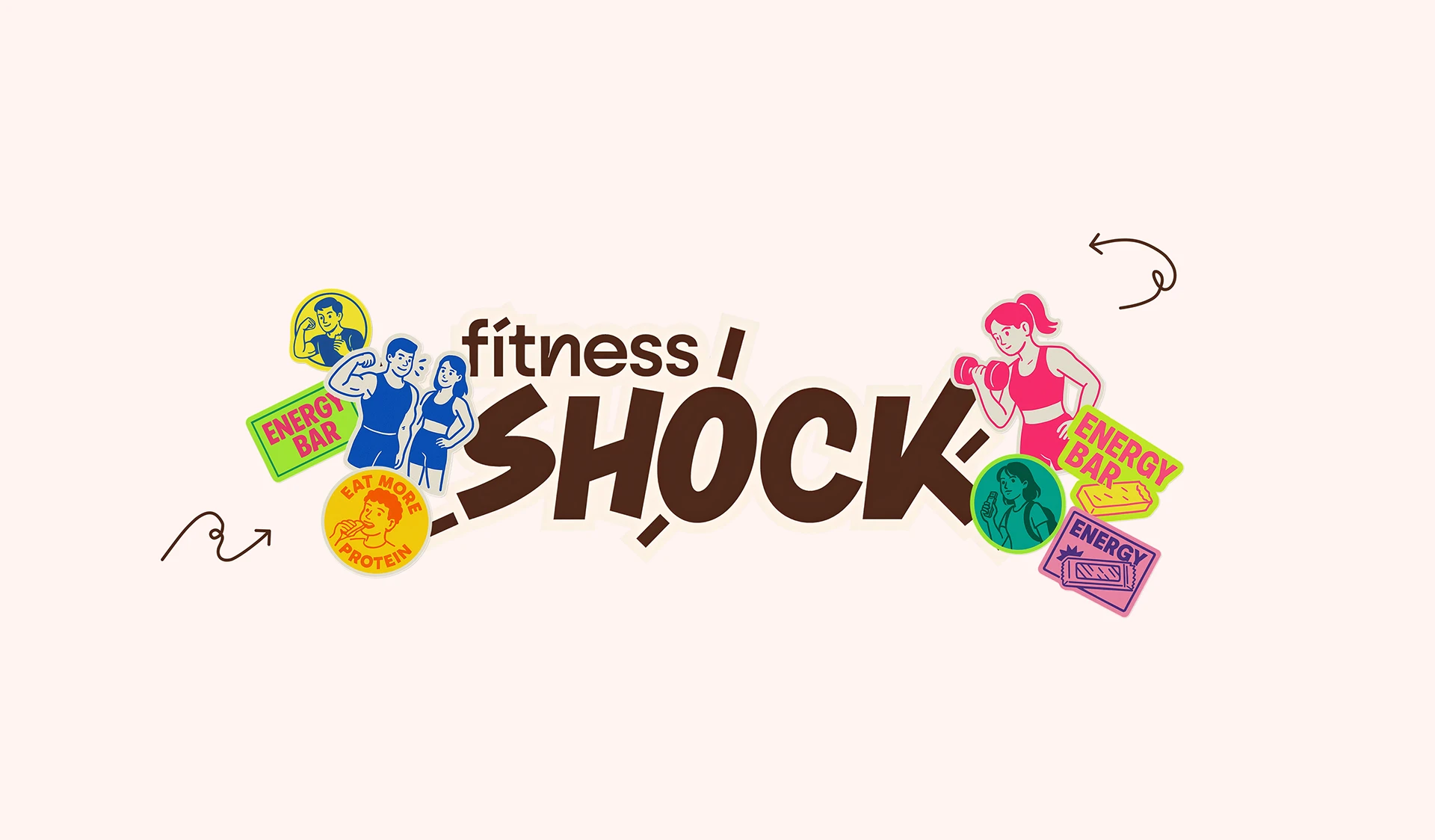
Fitness Shock
Russia — FMCG
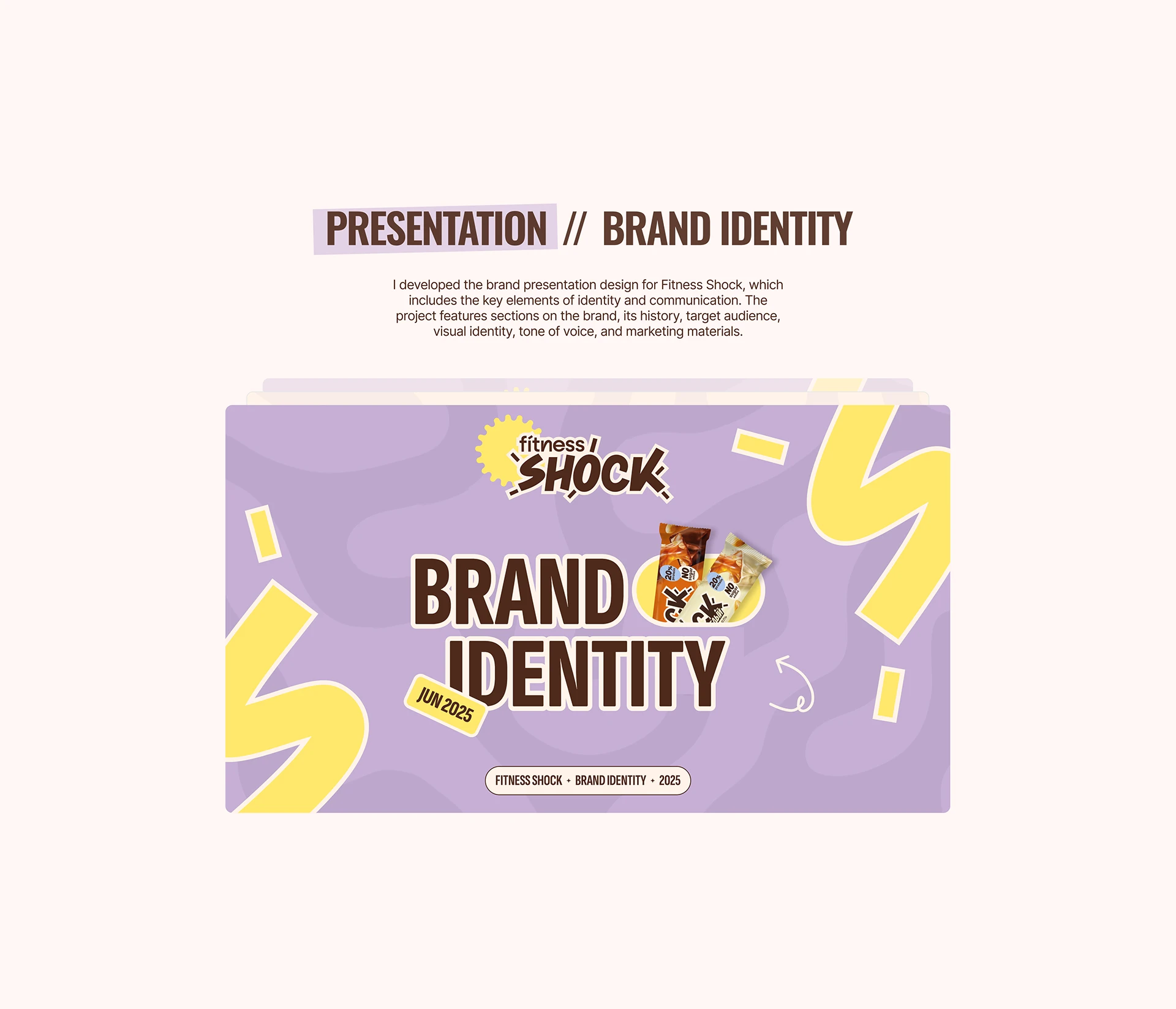
Brand IdentityLogo DesignPresentation DesignVisual IdentityPackaging Design
Client
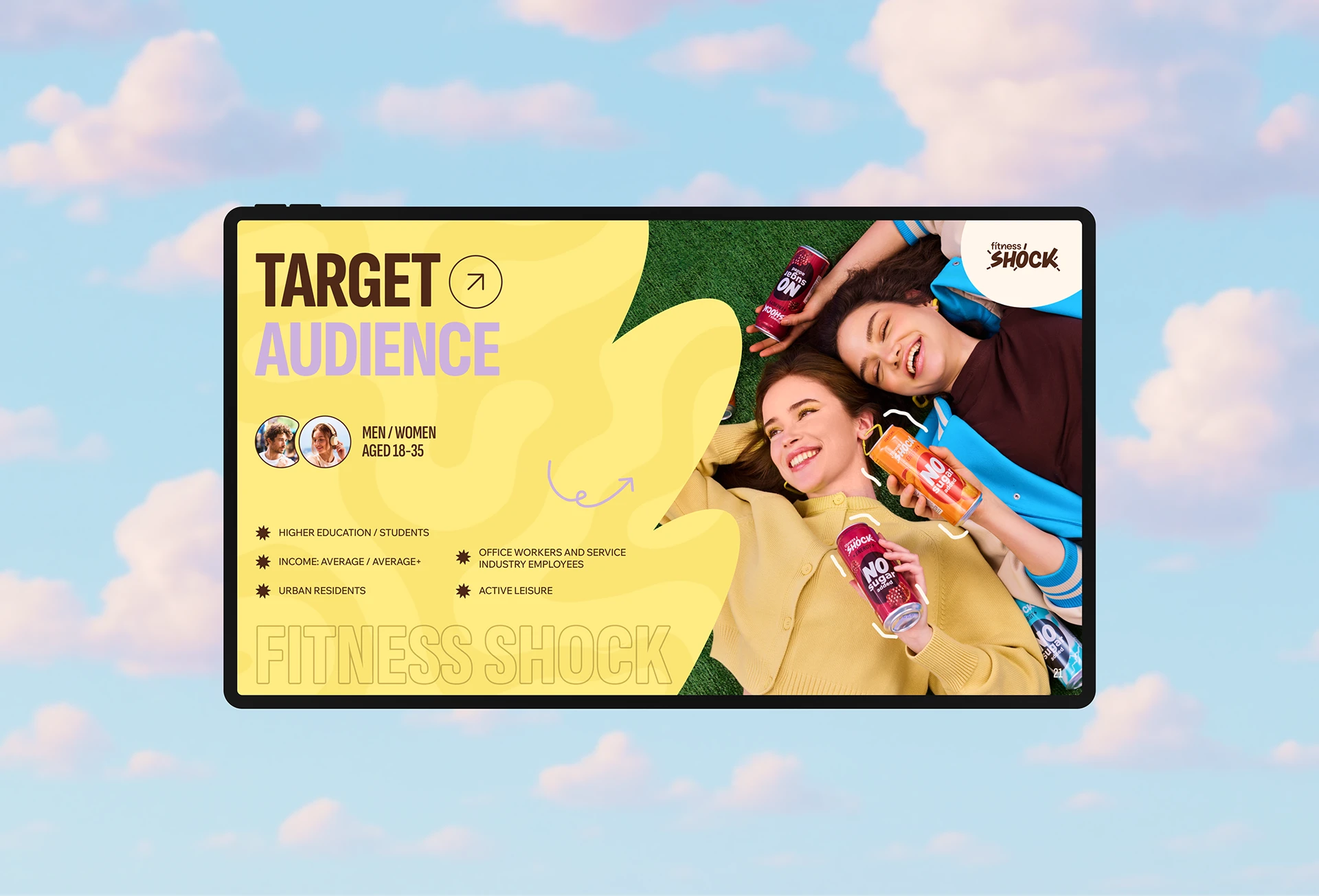
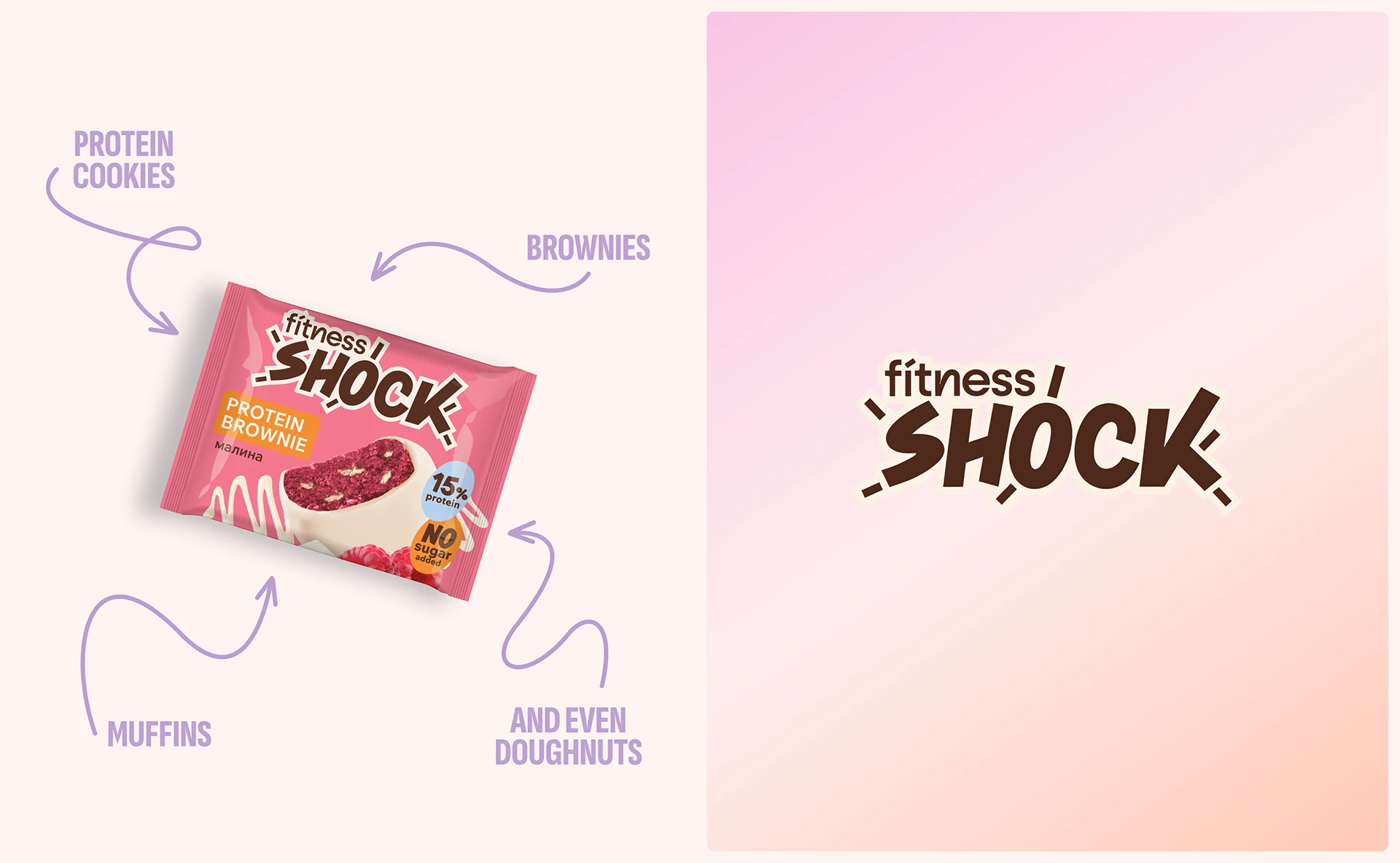
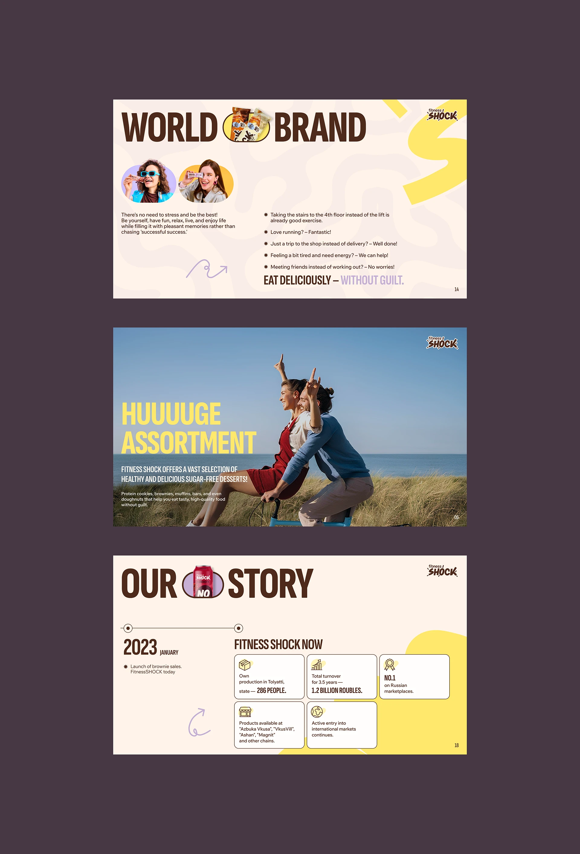
Fitness Shock is a Russian fitness snack brand producing protein brownies with no added sugar and 15% protein — targeting health-conscious urban adults aged 18–35 who refuse to choose between tasty and healthy.
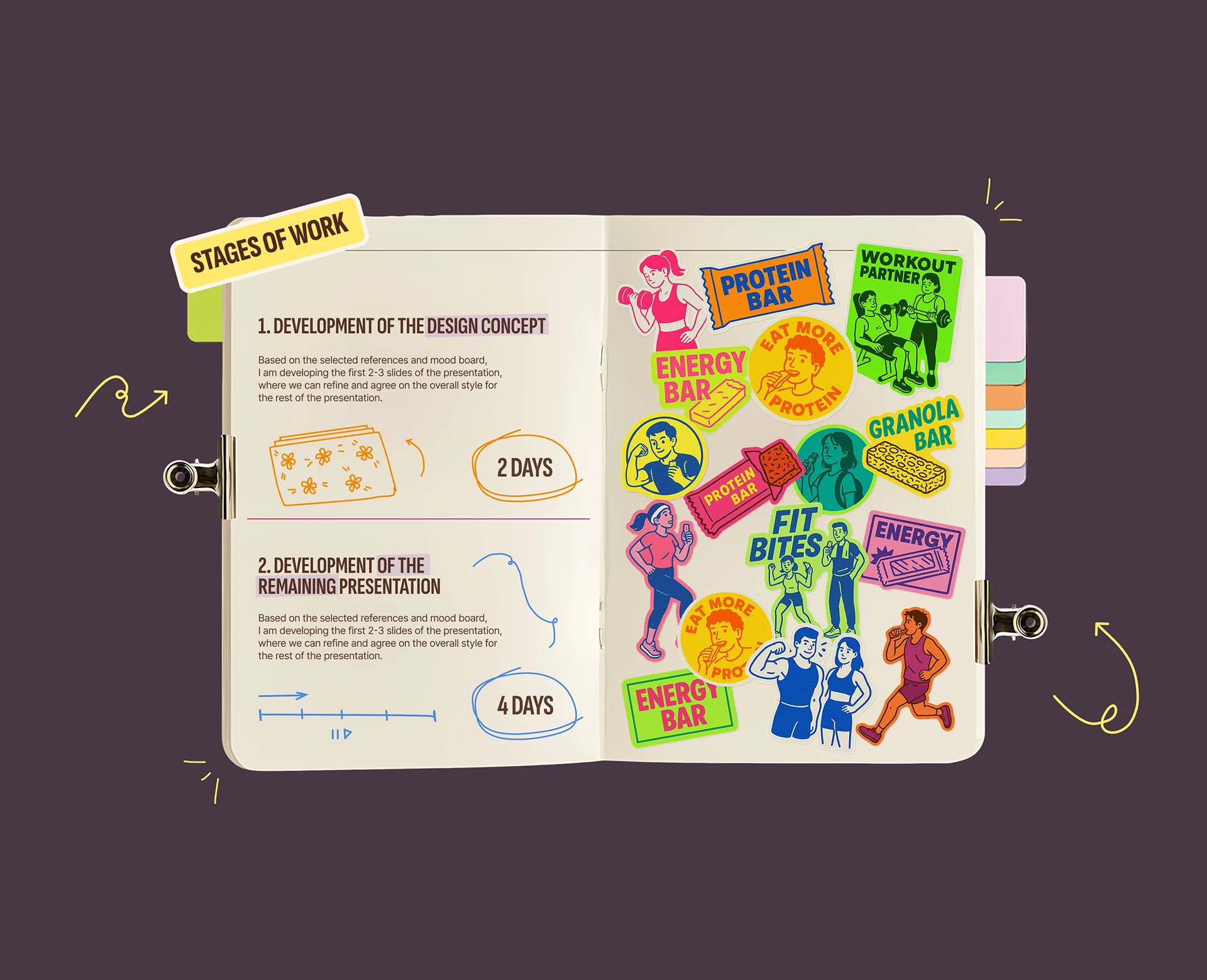
Process
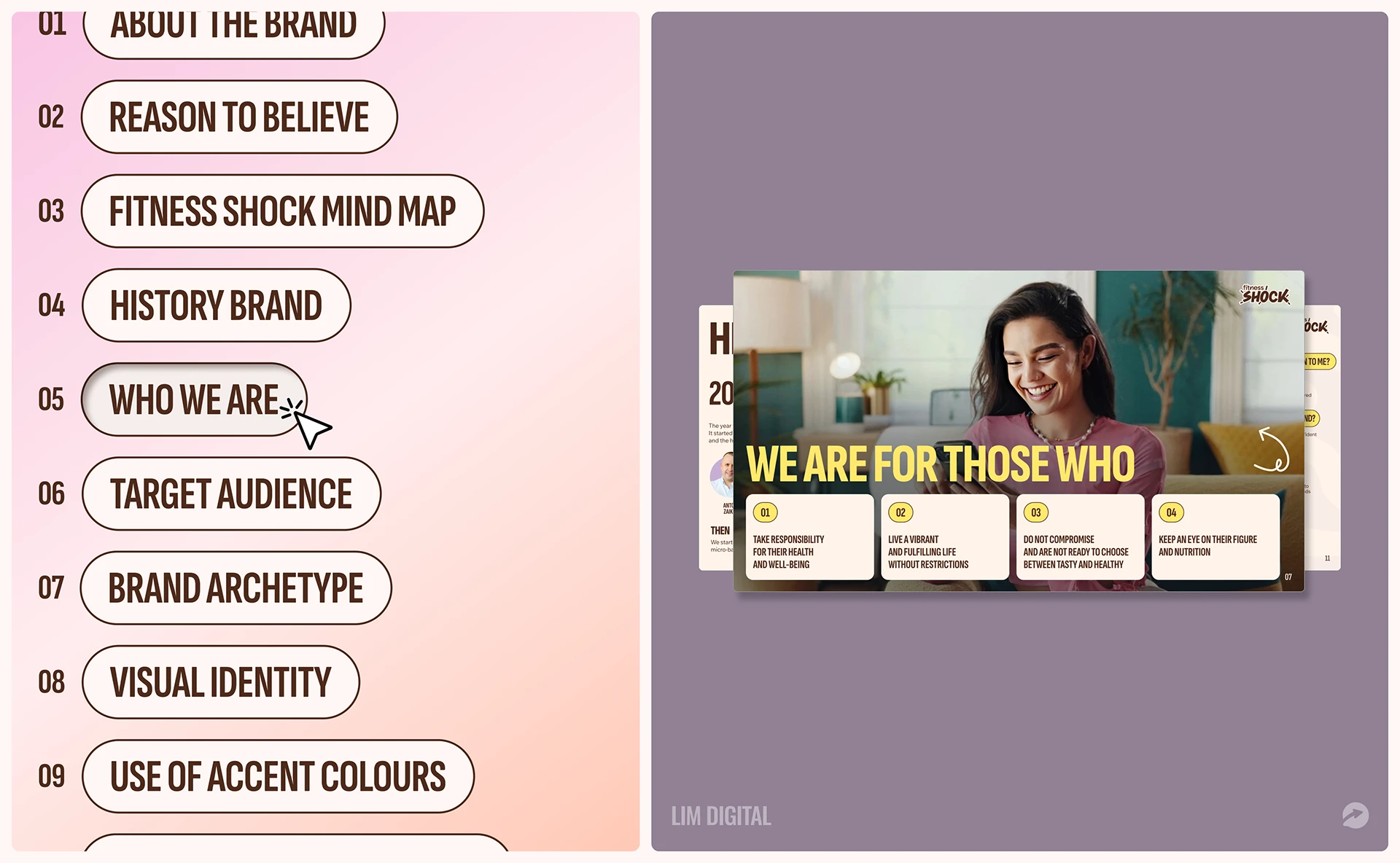
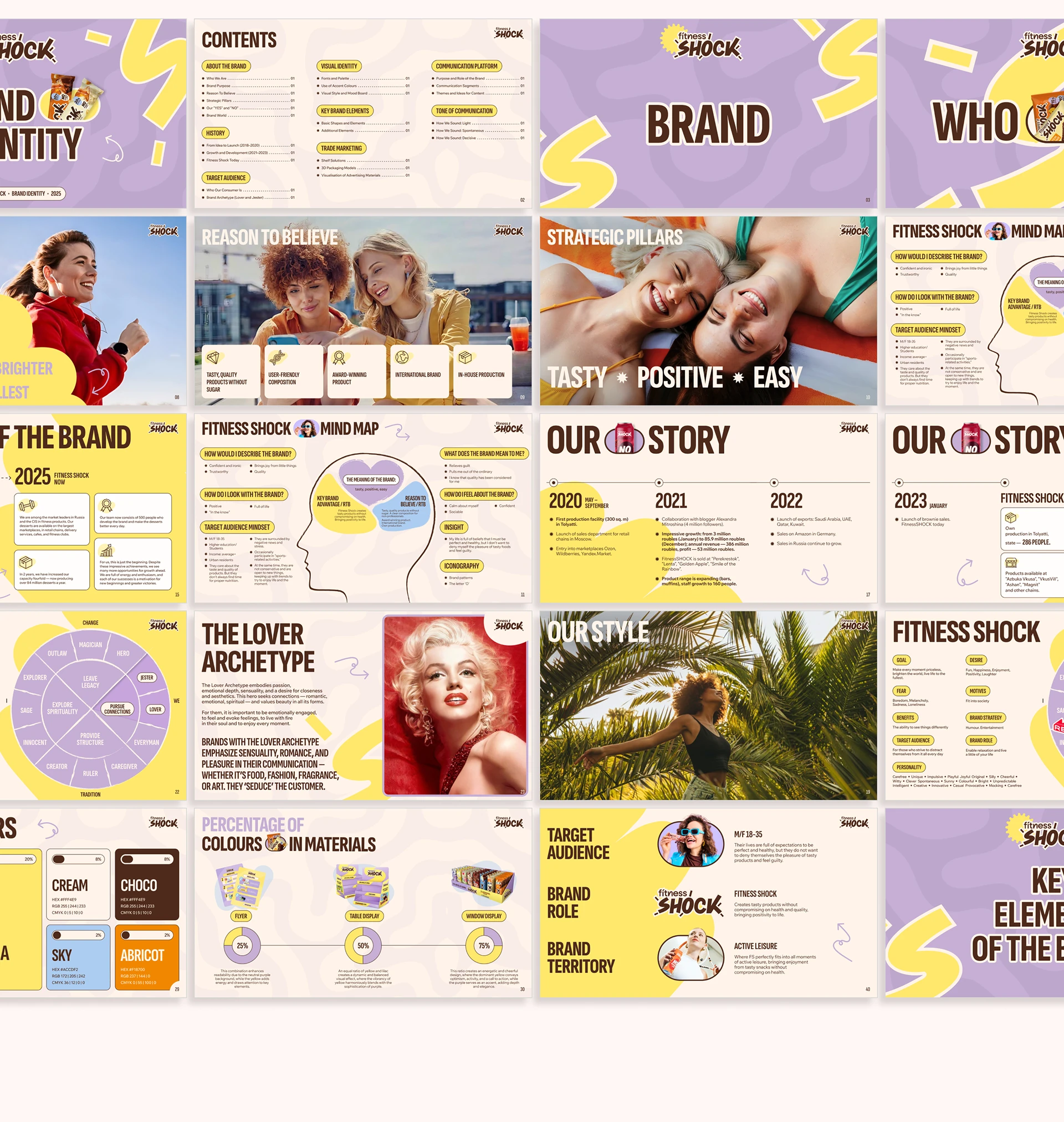
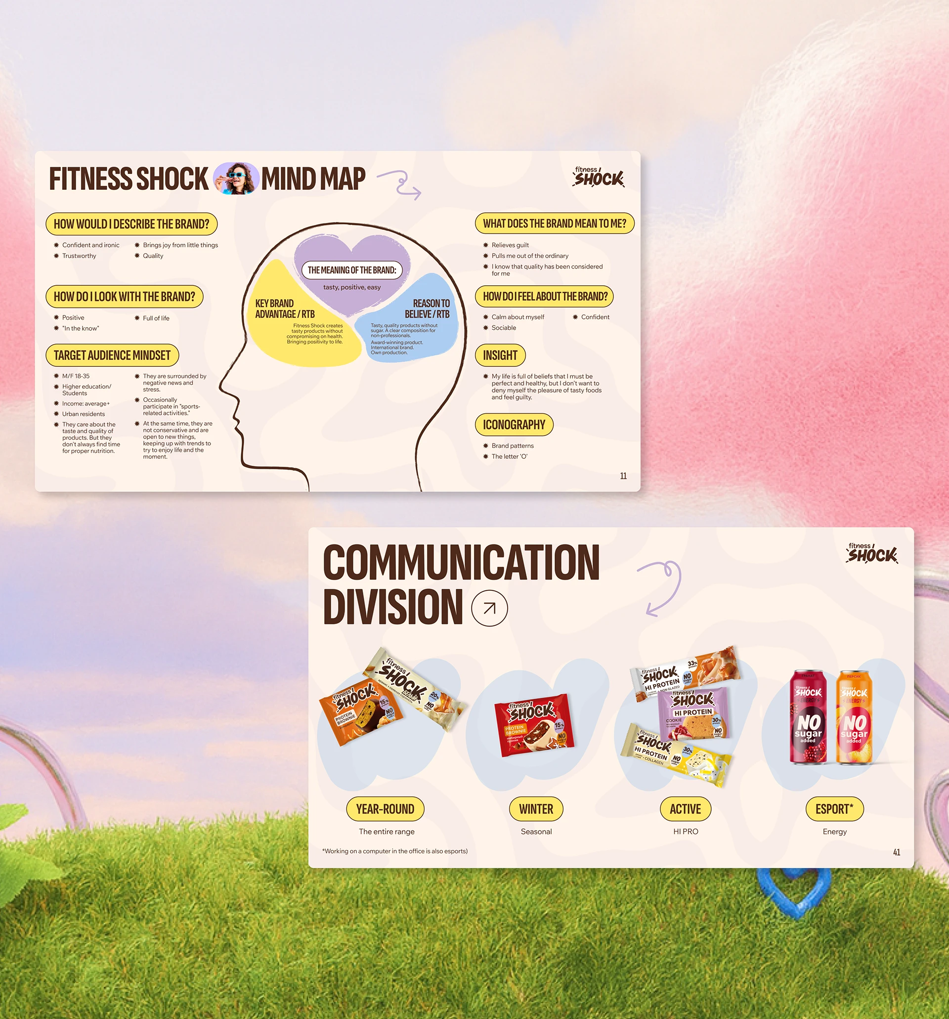
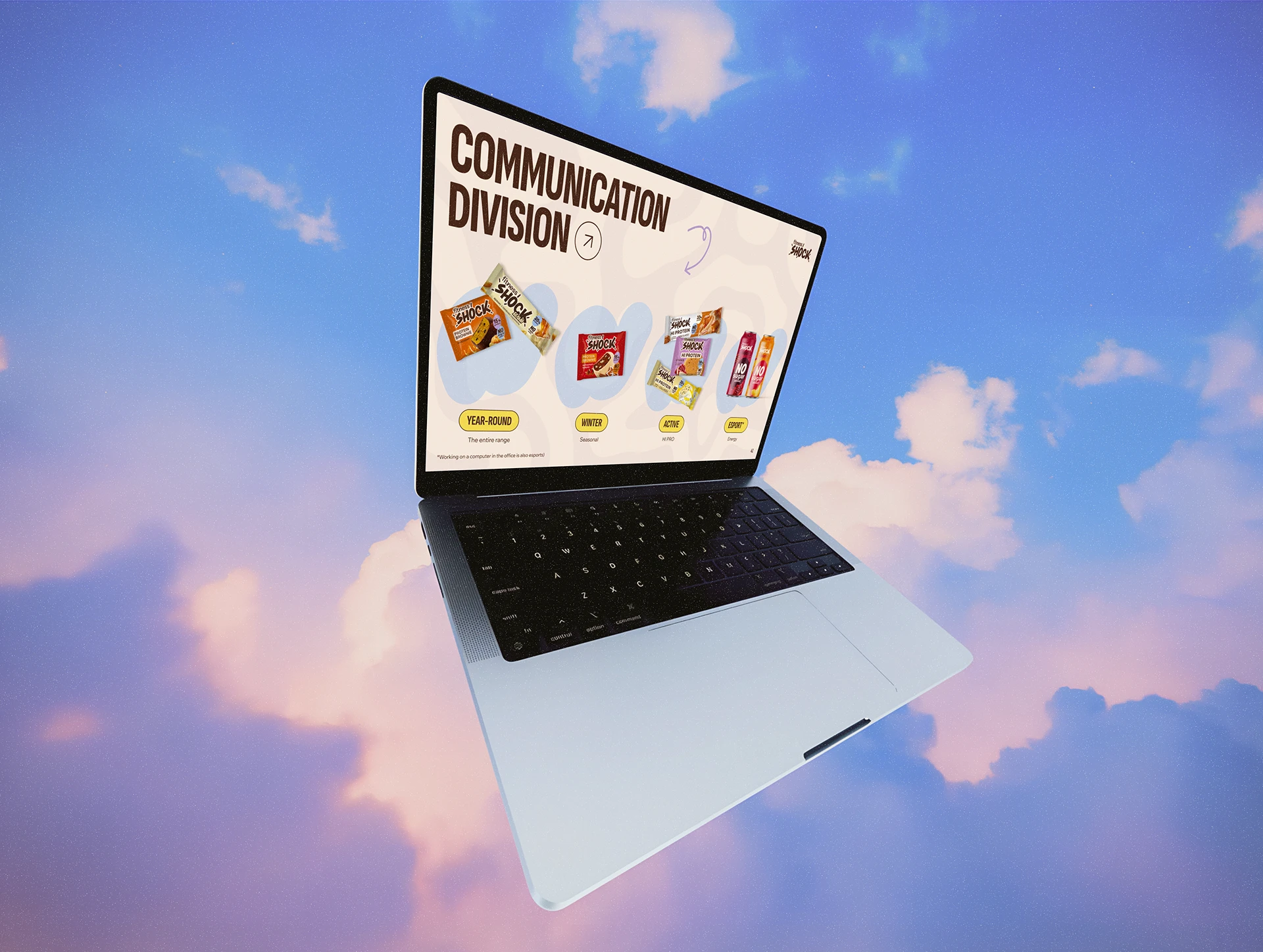
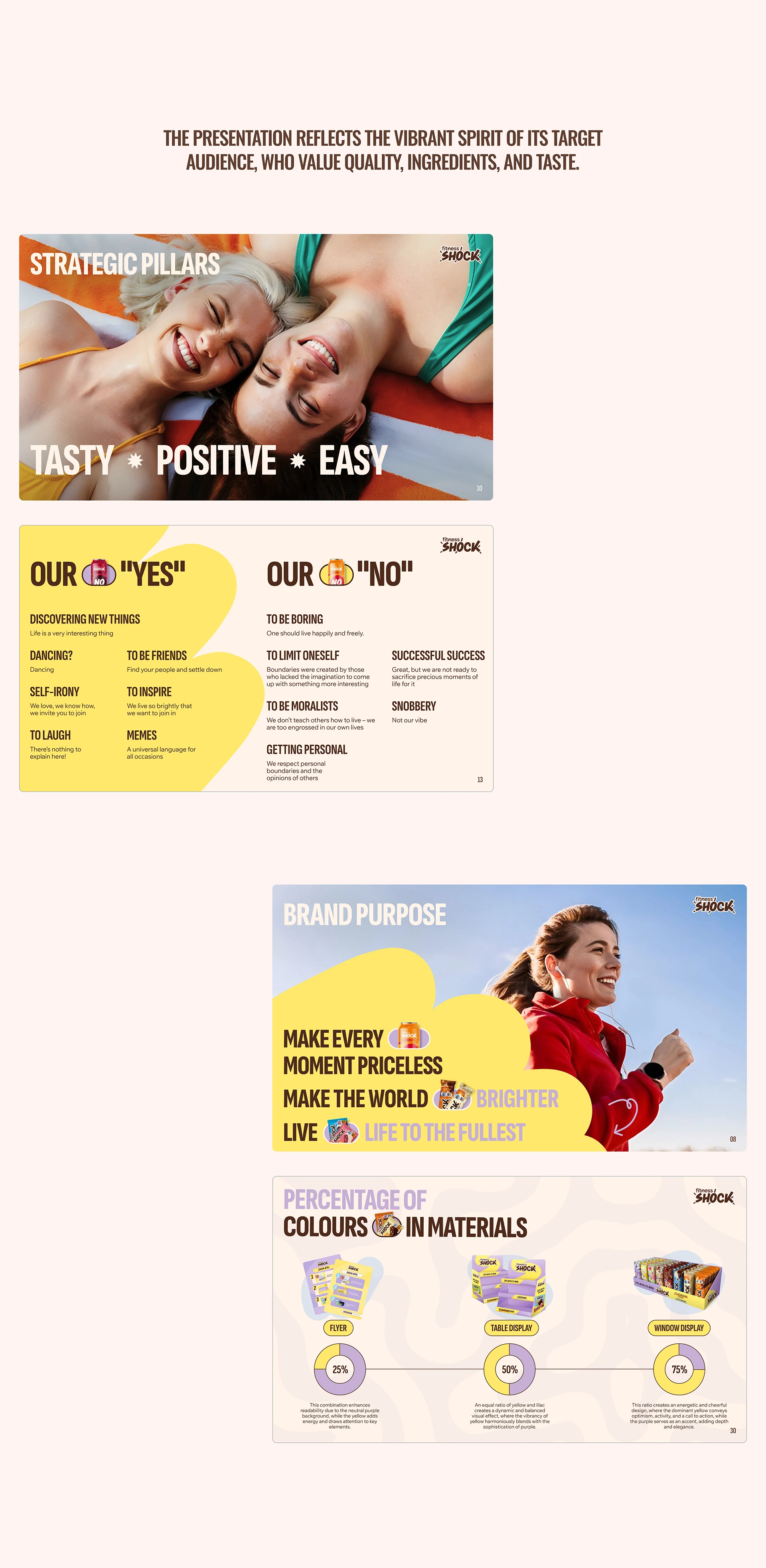
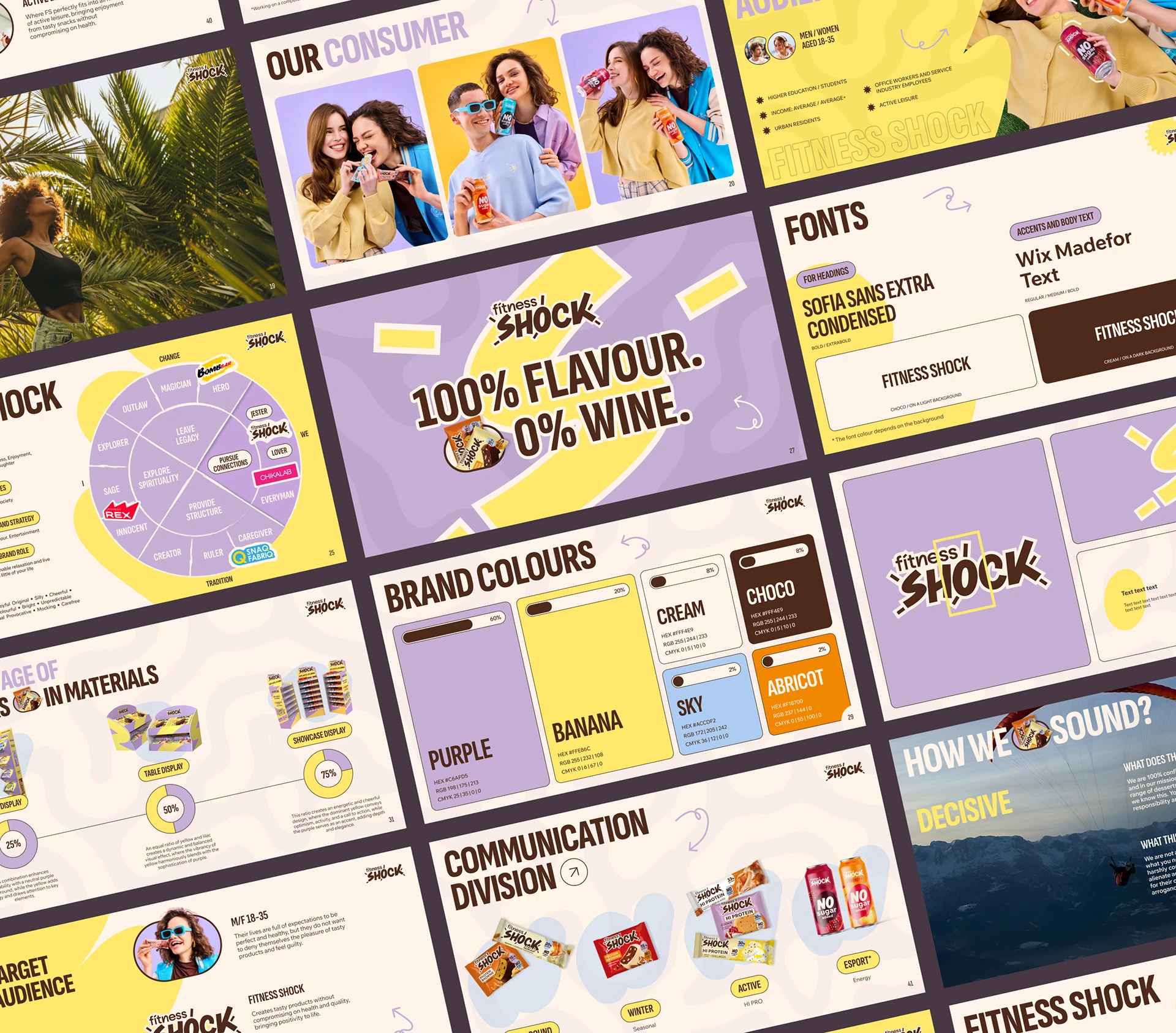
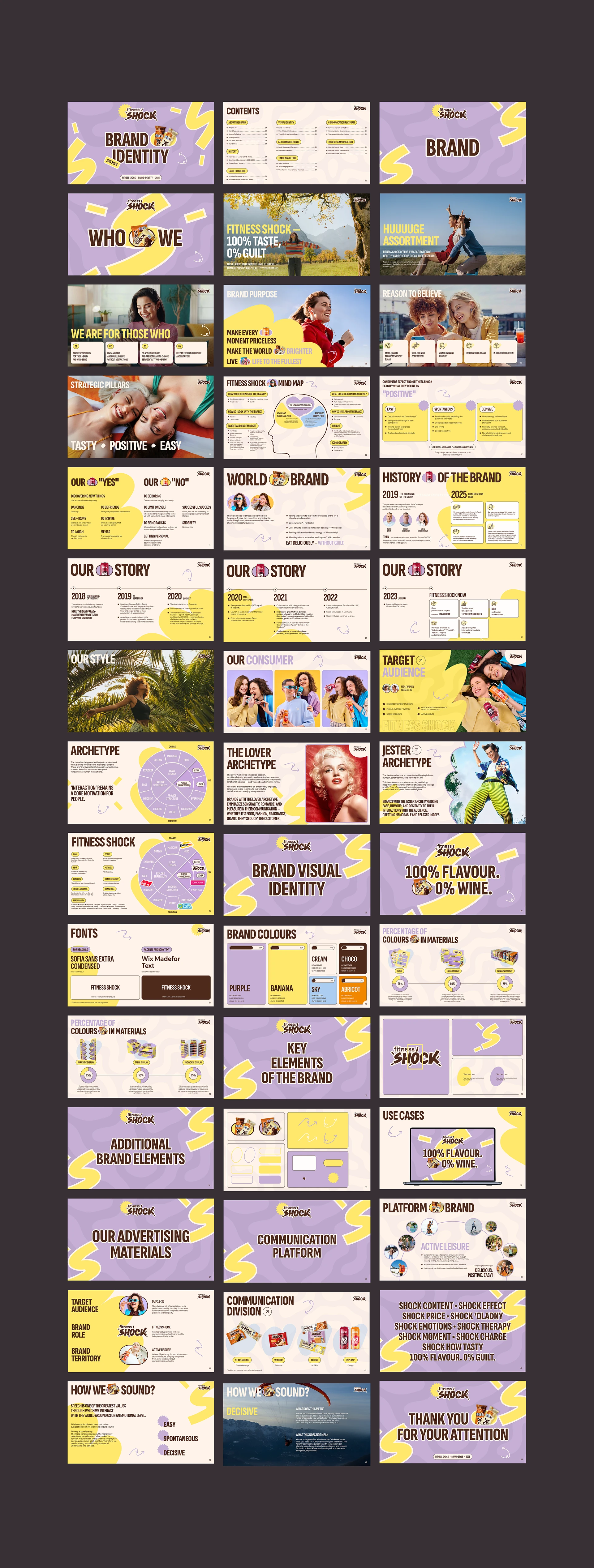
Developed a full brand identity presentation covering 9 sections — from brand history and mind map to target audience, brand archetype, visual identity, accent colour system, and tone of voice. The playful, bold aesthetic uses warm browns, lavender, and yellow to reflect the brand's fun yet health-focused positioning.
9 SectionsFull Brand Book Designed.
18–35Audience Persona Defined.

Start your project